


In the textile and fabrication world, color precision matters. Whether you’re matching an existing installation, choosing a new colorway, or matching a client’s detailed request, what you see on your screen needs to come as close as possible to what arrives at your shop. Differences in monitors, color profiles, and viewing environments can all impact what you see, so here’s how to optimize your computer display for better e-commerce color accuracy.
1. Understand Why Colors Vary Online
Most product photos are prepared in the sRGB color space, the standard for the digital, web-based content. However, every monitor interprets that data differently depending on factors like brightness, color temperature, and contrast settings. In short, your “neutral gray” might look slightly warm or cool compared to someone else’s. The goal isn’t perfection, but consistency and awareness.
2. Start with Your Display Settings
- Turn off blue-light filters: Features like Night Shift (Mac), Night Light (Windows), or Eye Saver Mode add a warm tint to reduce eye strain but they distort color. Disable these when reviewing fabrics online.
- Reset color profiles: Use your display’s default or “sRGB” mode if available. Avoid vivid or dynamic presets, which exaggerate saturation.
- Set brightness to mid-range: Overly bright screens can wash out lighter fabrics, while dim screens deepen colors unnaturally.
- Neutral lighting helps: View your monitor in a room with balanced daylight or neutral white lighting, not warm tungsten or strong overhead LEDs.
3. Calibrate Your Monitor
For the best accuracy, use a calibration tool from companies like Datacolor or Calibrate. These programs measure your display and create a custom ICC color profile for true-to-life viewing. For most fabricators, running calibration once a month is sufficient.
No hardware calibrator? You can still make basic adjustments using free online tools. Search for “online monitor calibration” and follow the on-screen steps to tune brightness, contrast, gamma, and color balance.
4. Work in the sRGB Color Space
When saving or comparing design files, make sure your software (like Photoshop or Illustrator) is set to use the sRGB IEC61966-2.1 color profile. This keeps your digital view consistent with the color space used for web imagery on e-commerce sites.
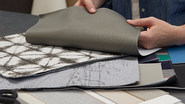
5. Verify with a Physical Swatch
Even with a perfectly calibrated monitor, environmental factors like dye-lot variation and lighting conditions mean no screen can replace a physical sample. For critical color decisions, especially for multi-roll projects, client approvals, or shade structure installations, always request a swatch before placing a full order.
6. Keep It Consistent Across Devices
Viewing a product on multiple screens? Try to compare fabrics on the same calibrated monitor each time. Mobile devices and tablets often oversaturate colors for visual impact, so use them for browsing, not final selection.
7. Quick Reference Checklist
- Turn off blue-light or night modes
- Use sRGB display mode
- Keep brightness moderate
- Calibrate monthly (hardware or online tool)
- Compare under neutral room lighting
- Order swatches for critical color matching
Accurate color begins with awareness. By taking a few minutes to optimize your display, you’ll make faster, more confident fabric selections while minimizing surprises when your order arrives.
Tip:If you rely heavily on digital design work, consider labeling your monitor’s calibration date or setting a recurring reminder to recalibrate. Consistency is key for long-term color accuracy.